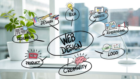
Four Website Design Considerations
 Two ways are available to design a site. You can try to build your website yourself, trying to figure what goes where and create the look that you want. You could either hire someone else to build it for you through consultations and collaboration. No matter if you choose to do it yourself or hire someone to build your website, whether you have a large budget or a small one, you should pay attention to the four considerations.
You can easily get caught up with what you need to do and show on your website. You want your products to be prominently displayed, as well as all of your services. Is all that information necessary? Are you the real focus of your website? Is it really about you?
Avoid the trap of creating your website to be viewed by and not the real users, the client.
Four Website Design Considerations
- User Experience
User experience, also known as UX to many, is the type of experience that your clients and potential clients have when they visit your website. Your website is the online face of your brand, so it’s important to ensure that it does a good job.
You’ve probably been to a lot of websites where you can’t seem to find anything and have left. It could be due to clutter, unclear verbiage, labeling or a lack or excessive amount of information. These websites focused more on themselves than their intended audience.
It’s easy to design a site without considering the actual users.
What are the best ways to create a better experience for users?
- Clean layout and flow. Make it easy to navigate and understand. This will make the experience interactive and fun. Nobody wants to have to search for your number.
- Consider what information will be of interest to users and where they’ll look. Place them in areas where they matter to ensure easy navigation.
- Reduce clutter. If you have too many flashing boxes on your page or a lot of information, it can be confusing to know what to click and where you will find the things you need. It also makes it difficult to understand who you are and what work you do. It should be clean, concise, and clear. You can also reduce clutter by:
- Even a little negative space goes a long ways. It helps to reduce confusion and headaches by directing the eye towards what you want.
- Use of bullet points, headings and short paragraphs is also helpful, as people are more likely to scan than read.
- Use simple language. Avoid jargon and complex words. Use simple phrases that everyone can understand. Don’t make them think about finding anything. Instead of “Employment Recruitment”, use “Jobs,” or other simple phrases.
- Mobile friendly. Nobody will stay on your website if it’s not compatible with their device. You’ve probably experienced the frustration of a website that doesn’t function on a tablet or mobile phone.. Being mobile-friendly should be standard in the modern world. However, you should check.
- Make your site appealing. Avoid using colors that are so clashing that they overwhelm users to the point where it is painful to look at the website. The difference between two colors is not as simple as it sounds.
- Consider Personas.
Why do you want to build this website? Why are you building this website? To promote or build your brand? The ultimate goal of any business or organization should be to sell products, services, or ideas. To make a difference. A website’s purpose is to tell clients and prospects who you are, and what you do. Why not build your website to appeal to that audience? Why not change your website to meet the needs of your customers?
When building your website, you should know what personas to use. What are your existing customer segments? Who do you want them to be targeted at? Understanding how your customers think and what motivates them to purchase is key. Do they prefer to be influenced by numbers or statistics? Who are your customers? Why would they buy your product/services? Are they younger millennials who are tech-savvy or older generations that want more personal contact. When you design your website, consider what matters to your target audience. Consider how you will be found. What they would like to do. What information do they need?
Do not panic and hyperventilate. It’s important to understand your audience, not only for your website but also for your business. Developing personas, whether you do it yourself or with the help of a company, is never a waste. Knowing all of this can help you understand your target audience and increase conversions. It also leads to better customer relationships.
You can use what you learn to create a website that is tailored to the personas you have created. It can tell you what kind of information and content your users want, how to structure the website (example: formal or informal tone/wording) and even what type of engagement they are looking for. You can use this to determine what you should focus on. You may need to add more content and forms on your website. Do you need a strong social media presence on your site? You can also include “typical information” such as your phone number, address, and email. You’ll be able to see what information needs to be placed in each area and the frequency of usage for your site.
Knowing your audience is key to the success of this blog.
- Easy to Contact
Make it easy for prospects to reach you. Why would they bother contacting you if they can’t reach you? Sell your product or service. Always make sure that your email address, phone number and mailing address are included.
What about the rest? What about social media? After all the time and effort you put into creating those posts, and gaining an audience, link them as well. (This can even help SEO a little).
CTAs are another way for people to get in touch with you. CTAs are an excellent way to generate leads. CTAs can be a checklist, whitepaper, quiz, free assessment or even a product demo. These are all ways to show off you and your product, while making it seem like you’re helping the client… which you are. You can help them and offer something interesting to them while showing you’re a leader or demonstrating your product. What is your main goal? This is about getting a prospect who has invited you for a meeting to ask for your information or have an individual conversation with you. Don’t waste paragraphs on things that are just a CTA or could lead to a deeper funnel.
- Delight Them.
You’re delighted when a friend who you were expecting brings your favorite food over. It makes them more appealing to you. Why can’t an organization do the same? Your website should have an “wow” factor. It can be fun or useful. It could be interactive screen shots of products, a Video or quirky copy. Your personality should shine through. Show your personality by using unique ways to express yourself. Clients are more likely to choose someone who makes them feel comfortable and happy.
Remember, when designing a site, it’s about what your customers want and need, not what you want. Keep these things in mind as you embark on the perilous path of building a website, or you can come to talk with us so we can get you started.